DEPT® Rebranding
2025
Visual Identitty • Brand Managing • Creative Direction • Social Media • Campaign • Paid Media • Image Prompting
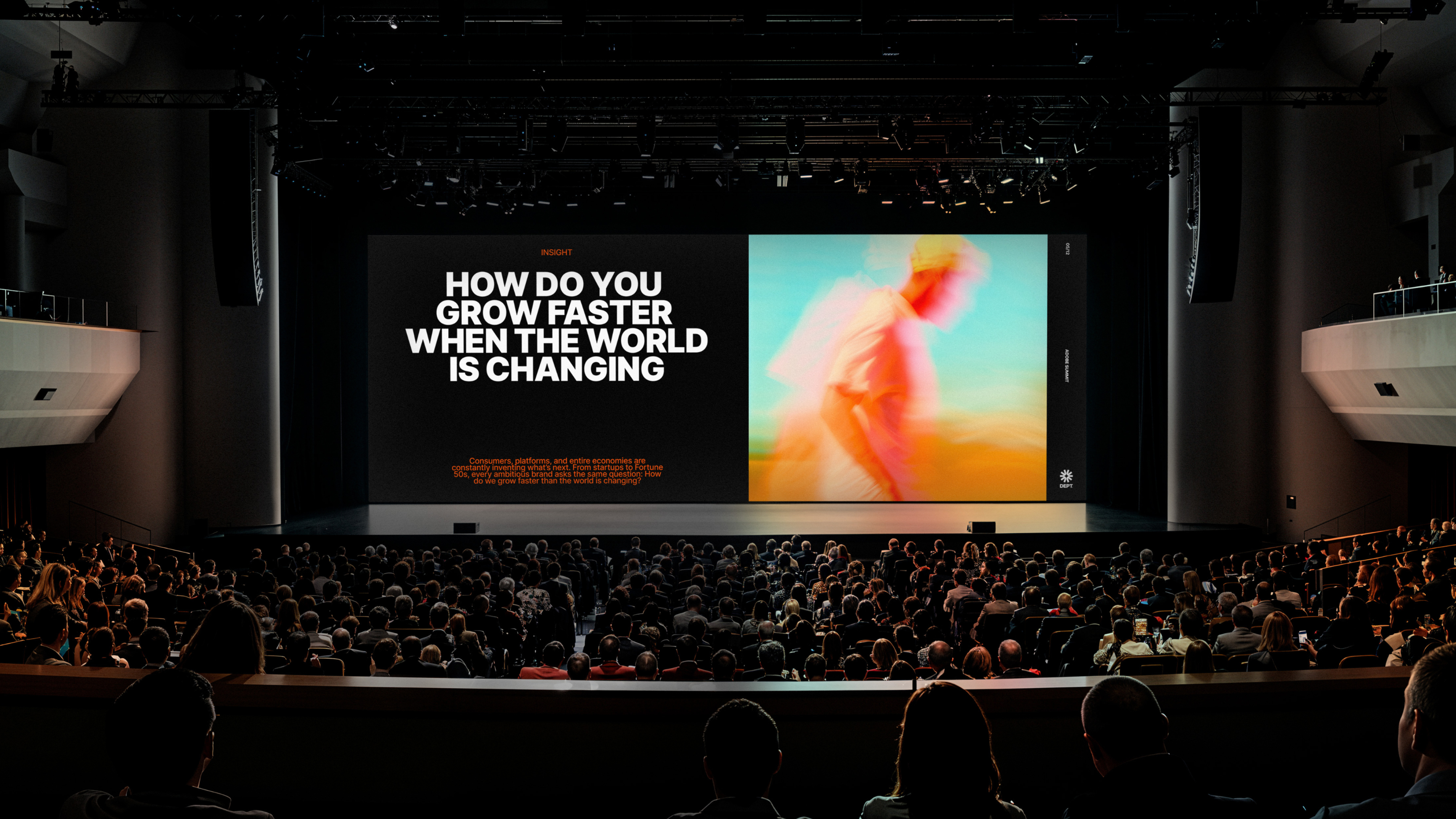
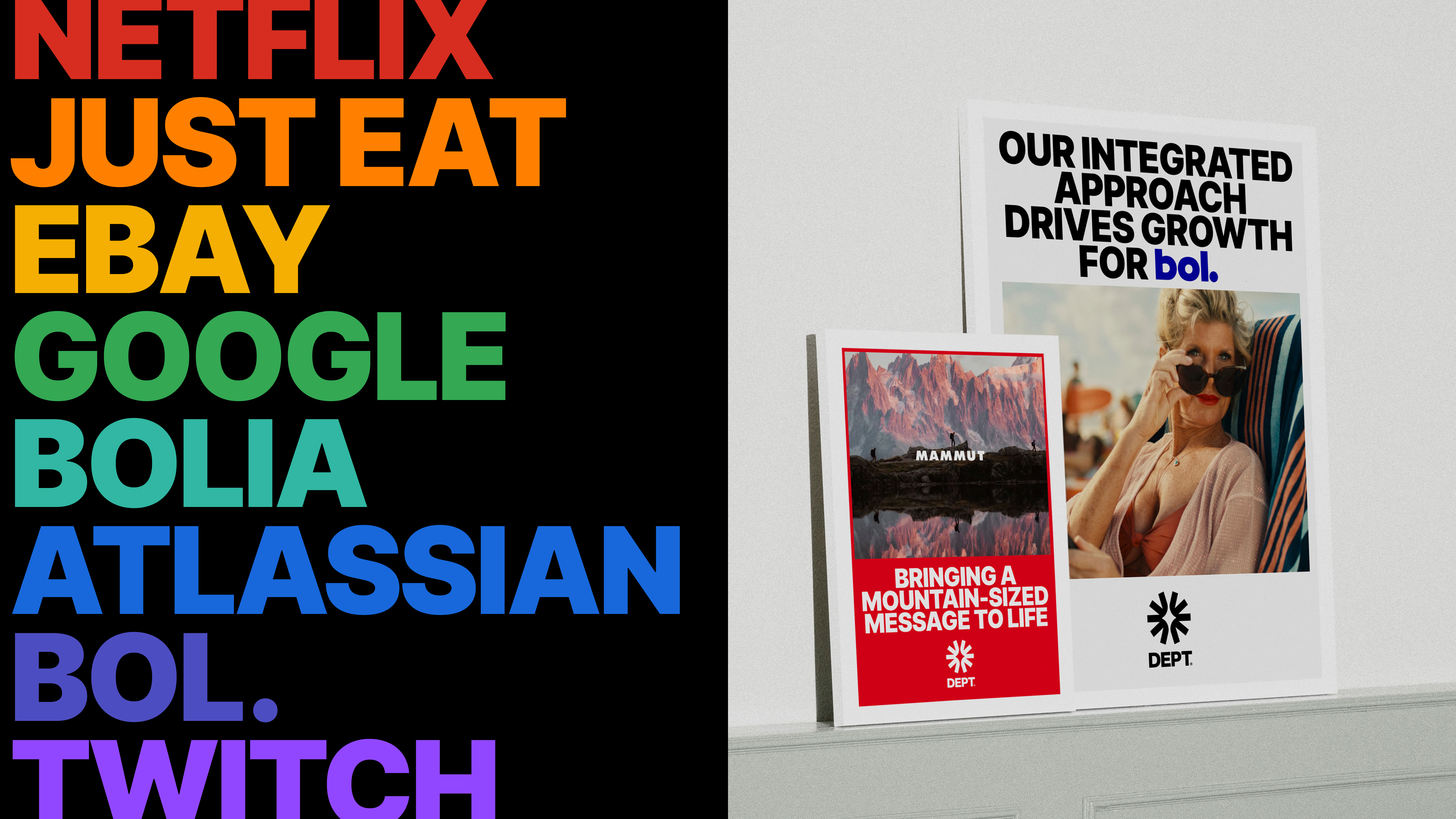
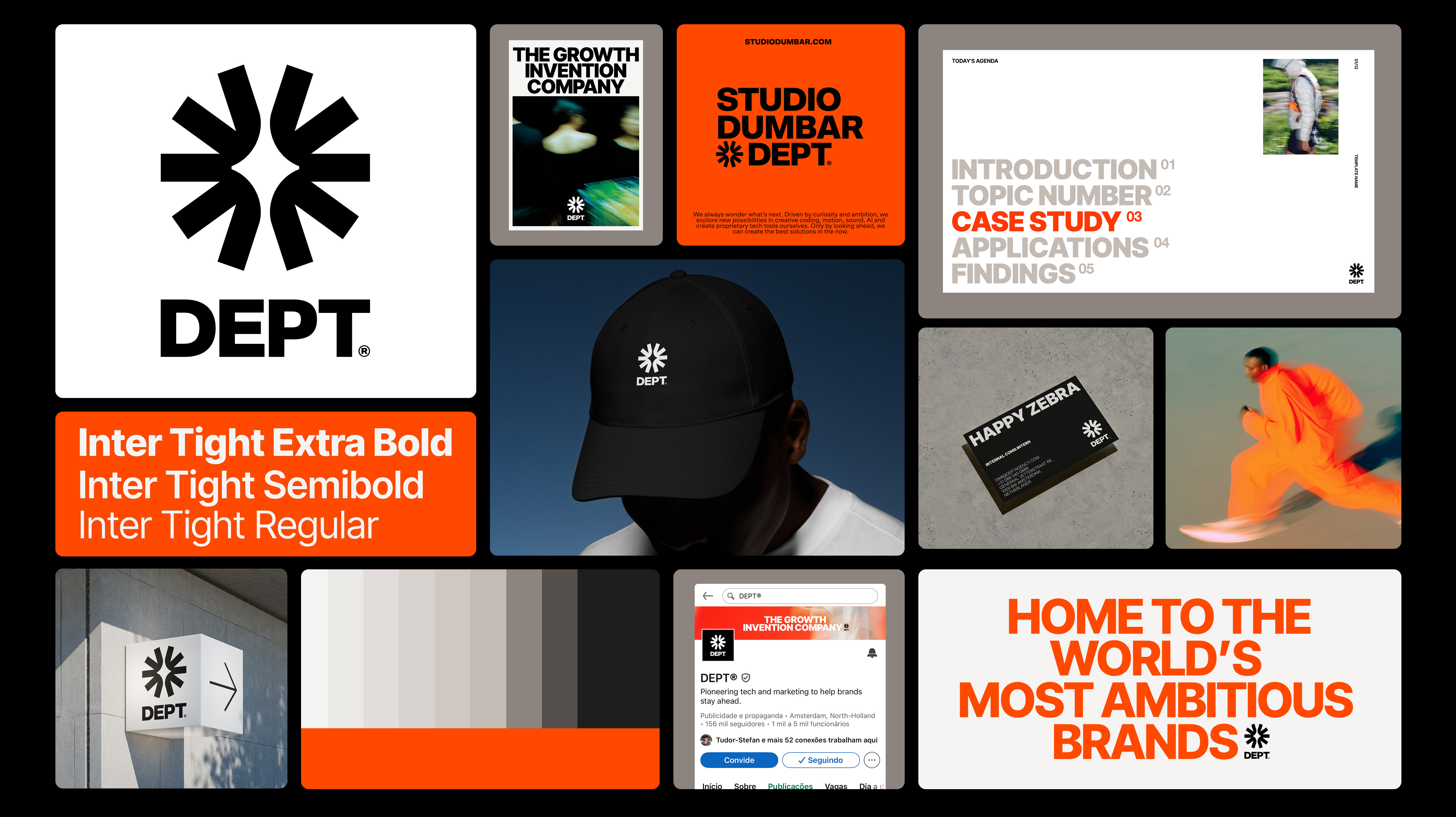
Created to mark DEPT®’s 10th anniversary, this rebranding reinforces the connection between marketing and technology that has been present since the company’s origins. The project places clients at the center of DEPT®’s work and introduces a refreshed visual system that reflects creativity, growth invention, and a forward-looking relationship with emerging technologies such as artificial intelligence.


h


DEPT® Global Brand Team
Graphic Design
Gustavo Schlindwein
Mia Mühlemann
Motion Graphics
Luiz Iranzo Ortega
Amanda Moyano Romero
Creative Prodution
Roanne de Kluizenaar
Global SVP of Marketing
Marjan Straathof
DEPT® UK Design Team
James Wood
Coralie Carré
David Gibson
Jack Harness
Jack Morgan
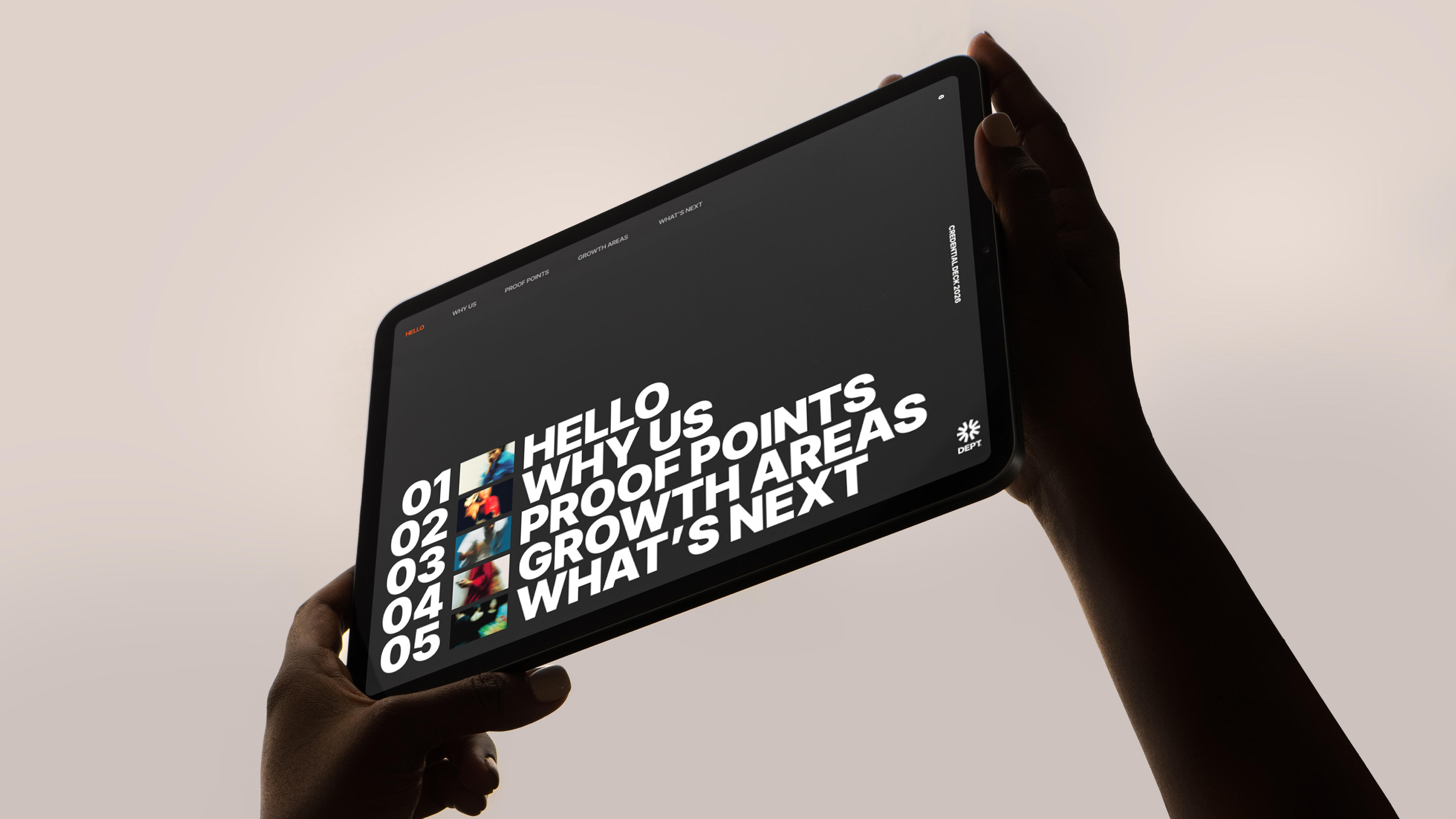
Developed on the occasion of DEPT®’s 10th anniversary, this rebranding project aimed to strengthen the relationship between marketing and technology, a core principle embedded in DEPT® since its early days. Another key objective was to reinforce the client as the central focus of every DEPT® project, shaping both strategic thinking and creative execution.
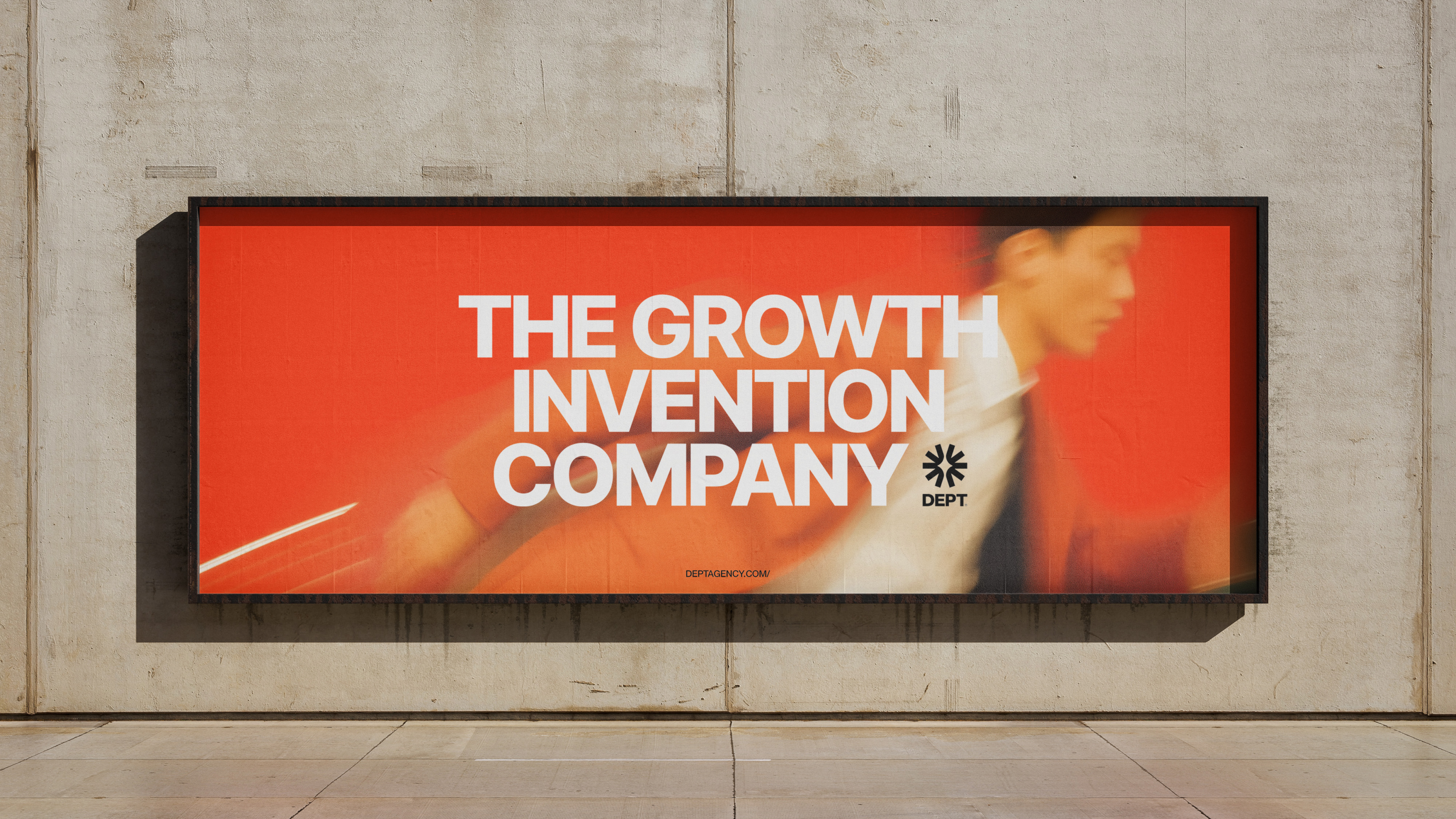
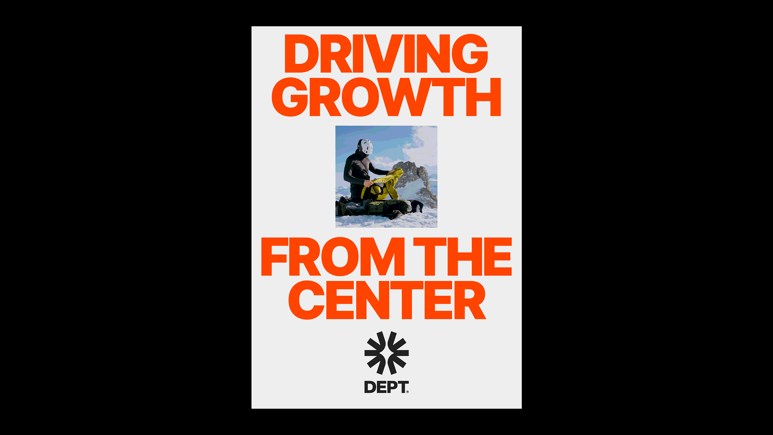
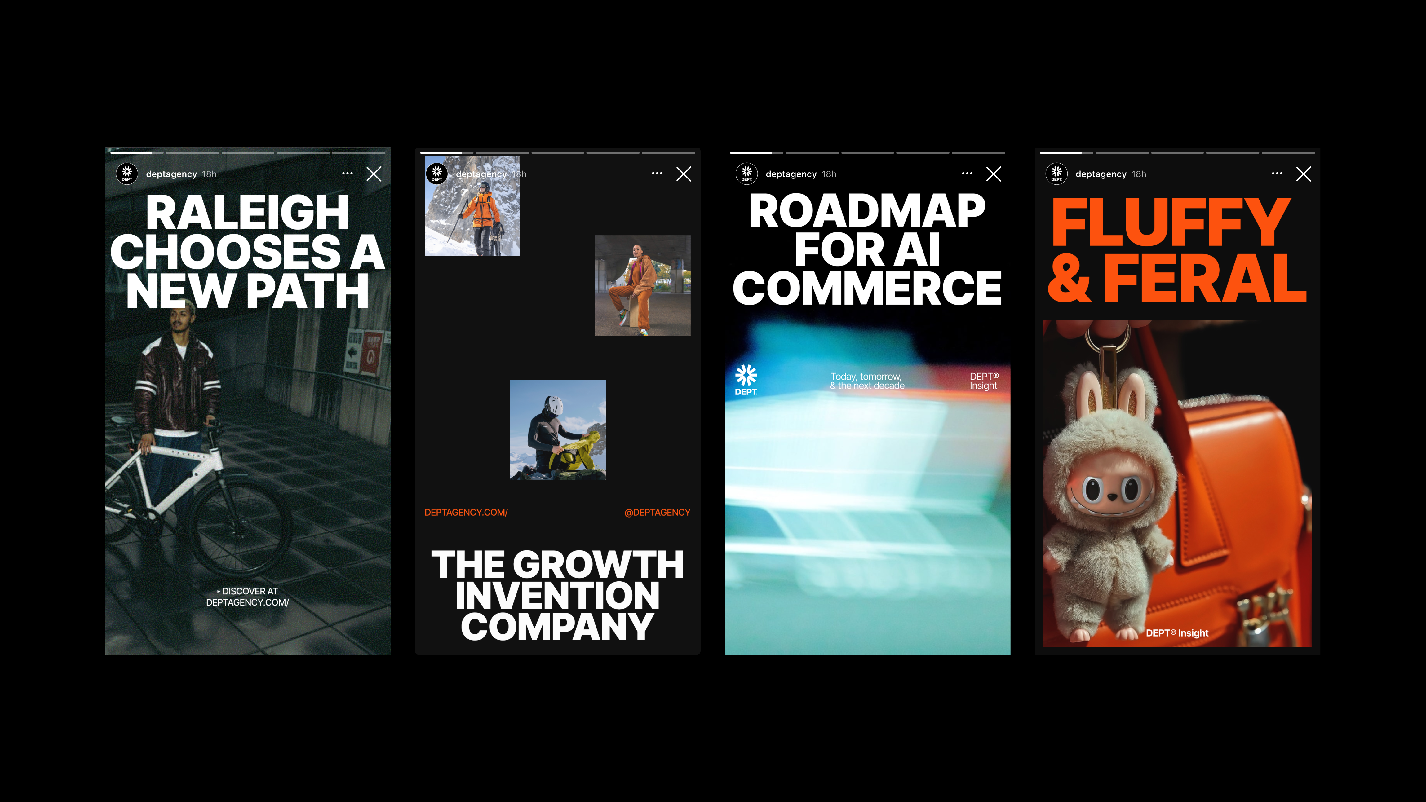
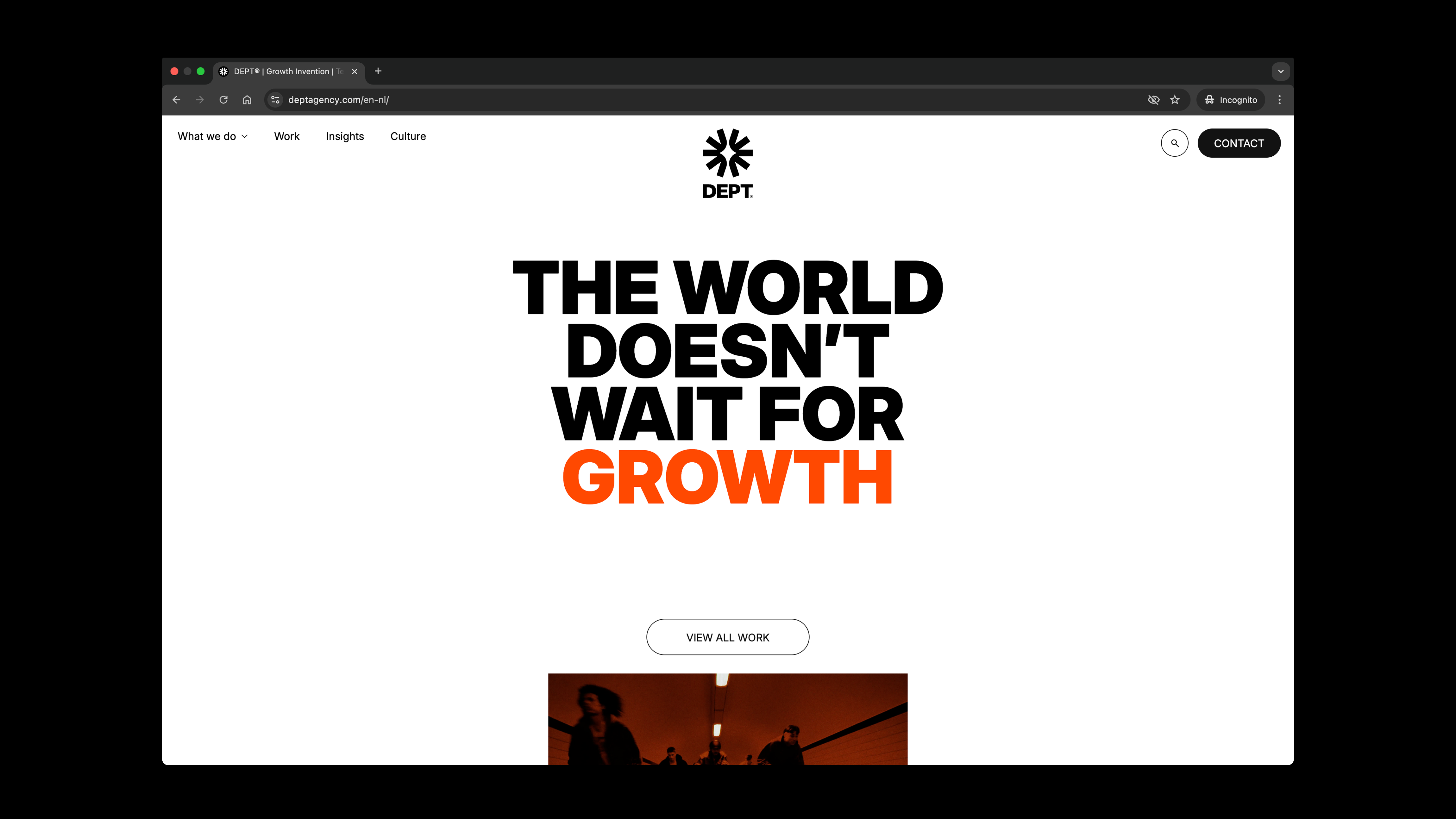
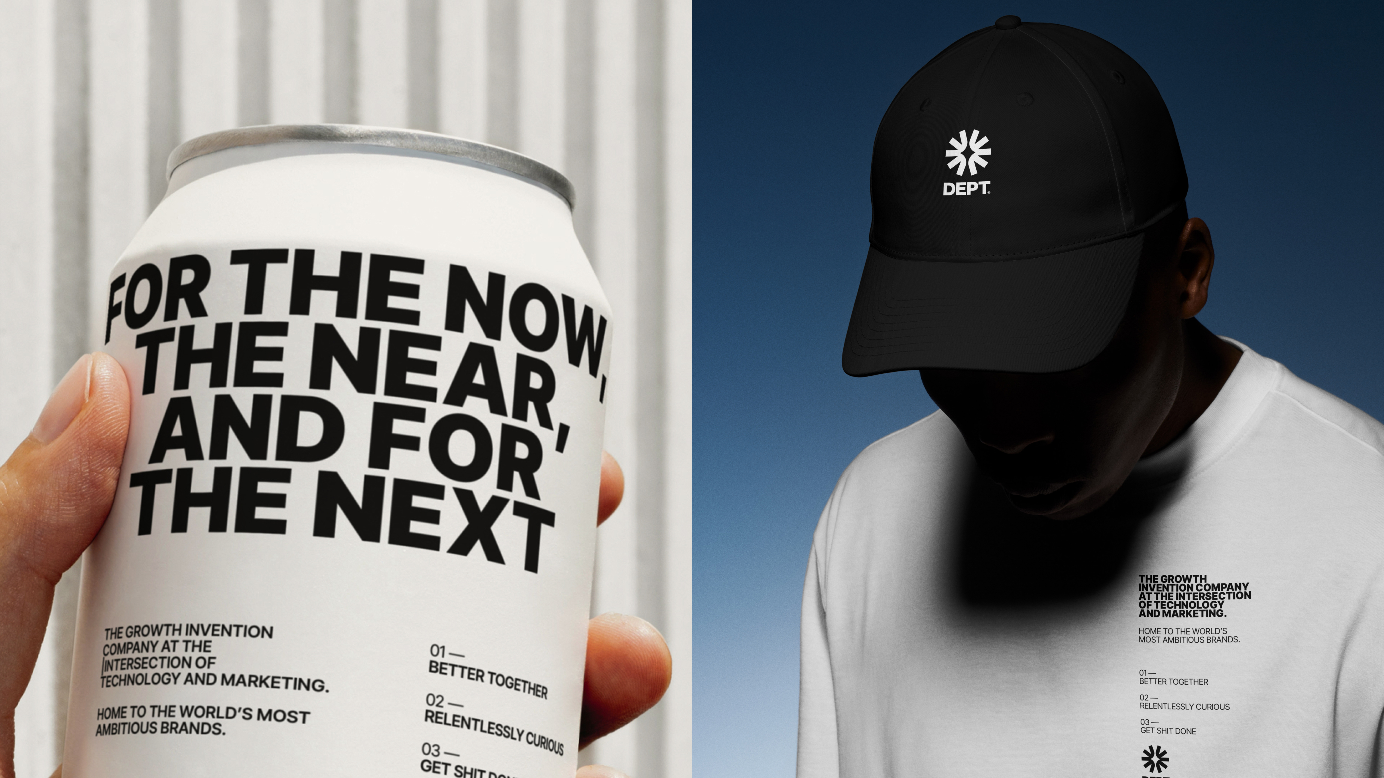
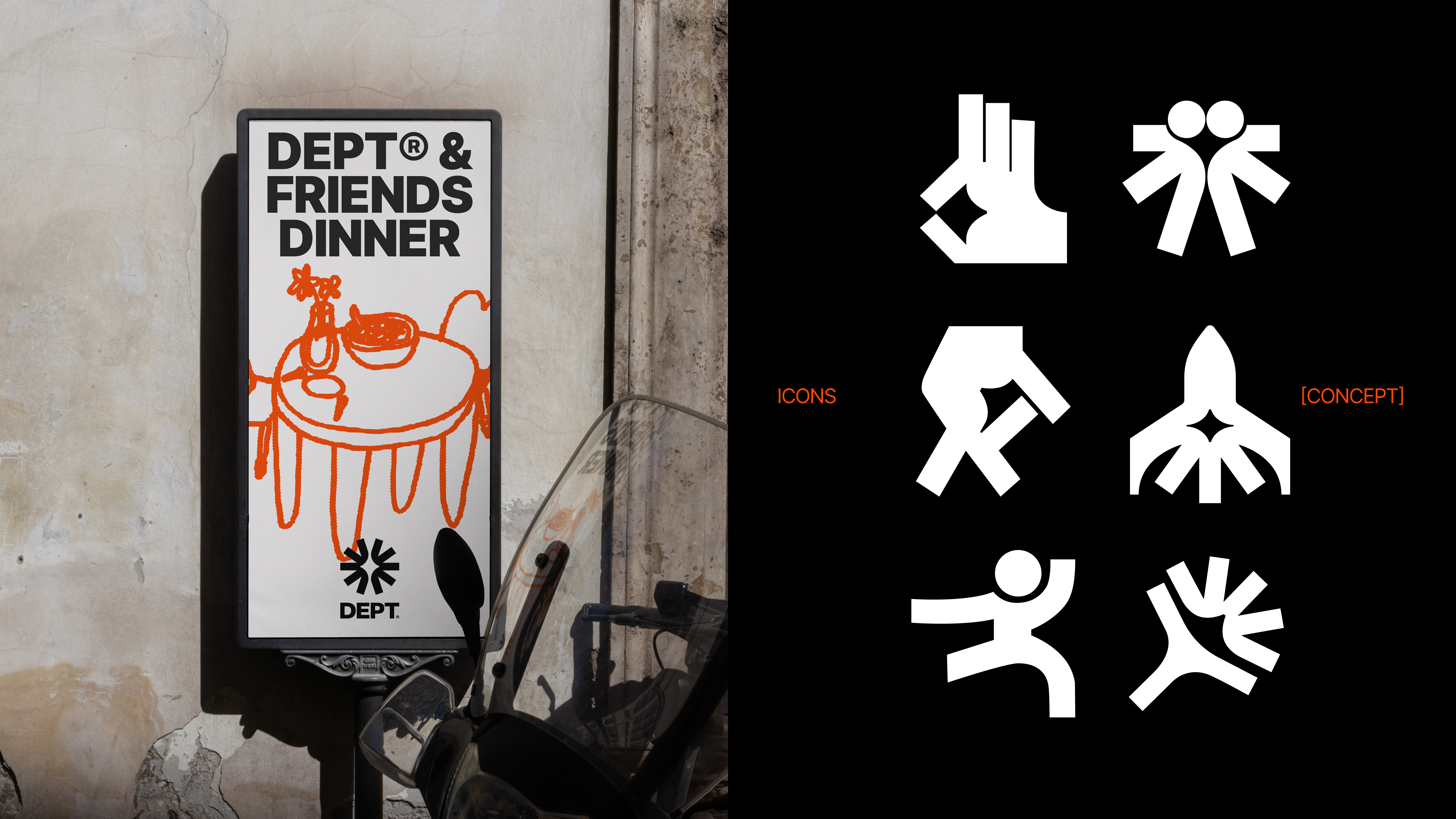
The expanding star was adopted as a central symbol, representing creativity as a driver for growth invention, the new guiding motto of DEPT®. The logotype was redesigned in close collaboration with DEPT®’s internal design team, ensuring alignment with the company’s culture and global presence.
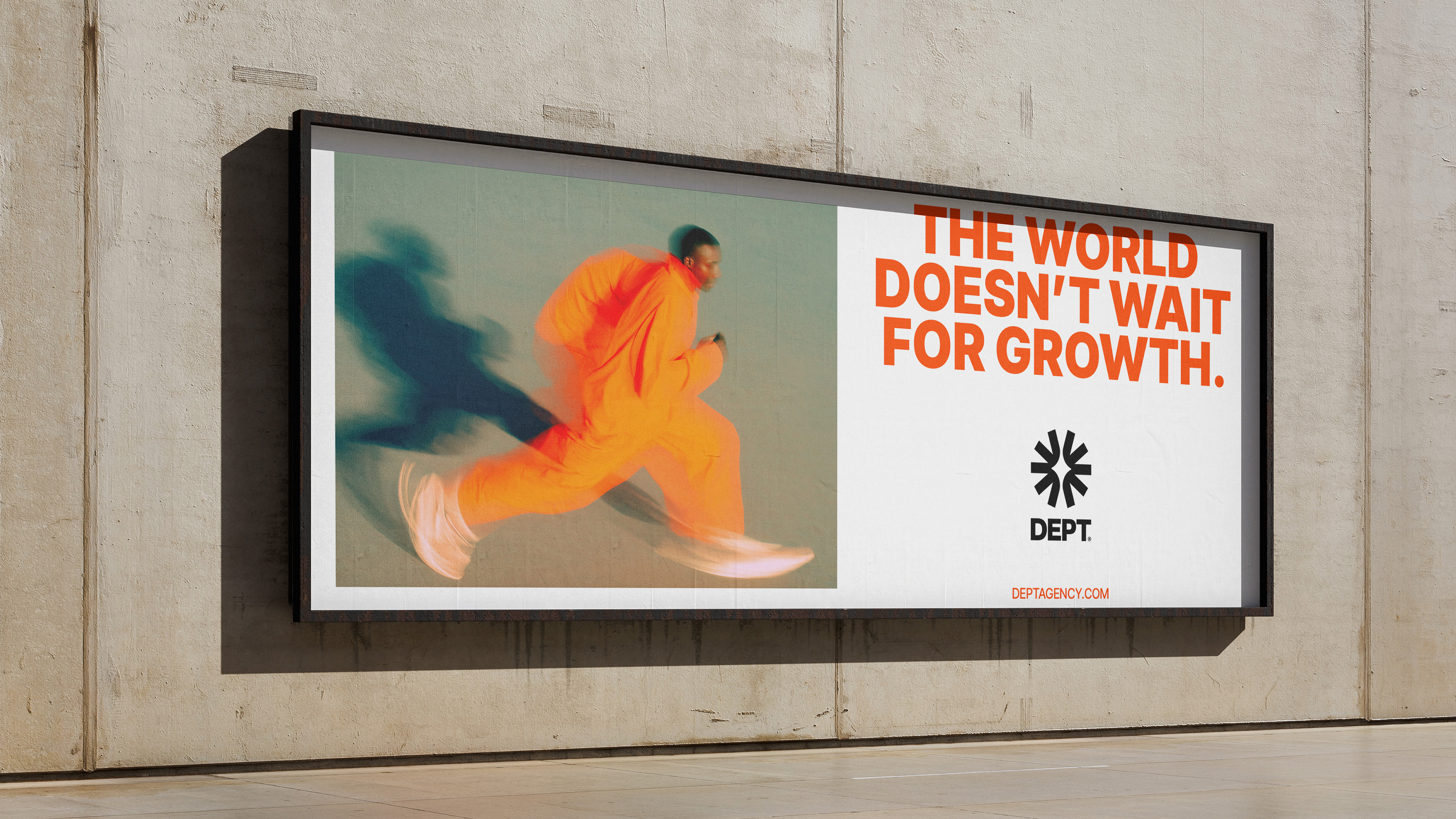
The visual universe introduced a new typeface, Inter Tight, selected for its clarity, flexibility, and ease of adoption across DEPT®’s 48 offices worldwide. A new color was also added to the palette. Orange was chosen to express the brand’s bold and transgressive spirit while bringing warmth and energy to the system.
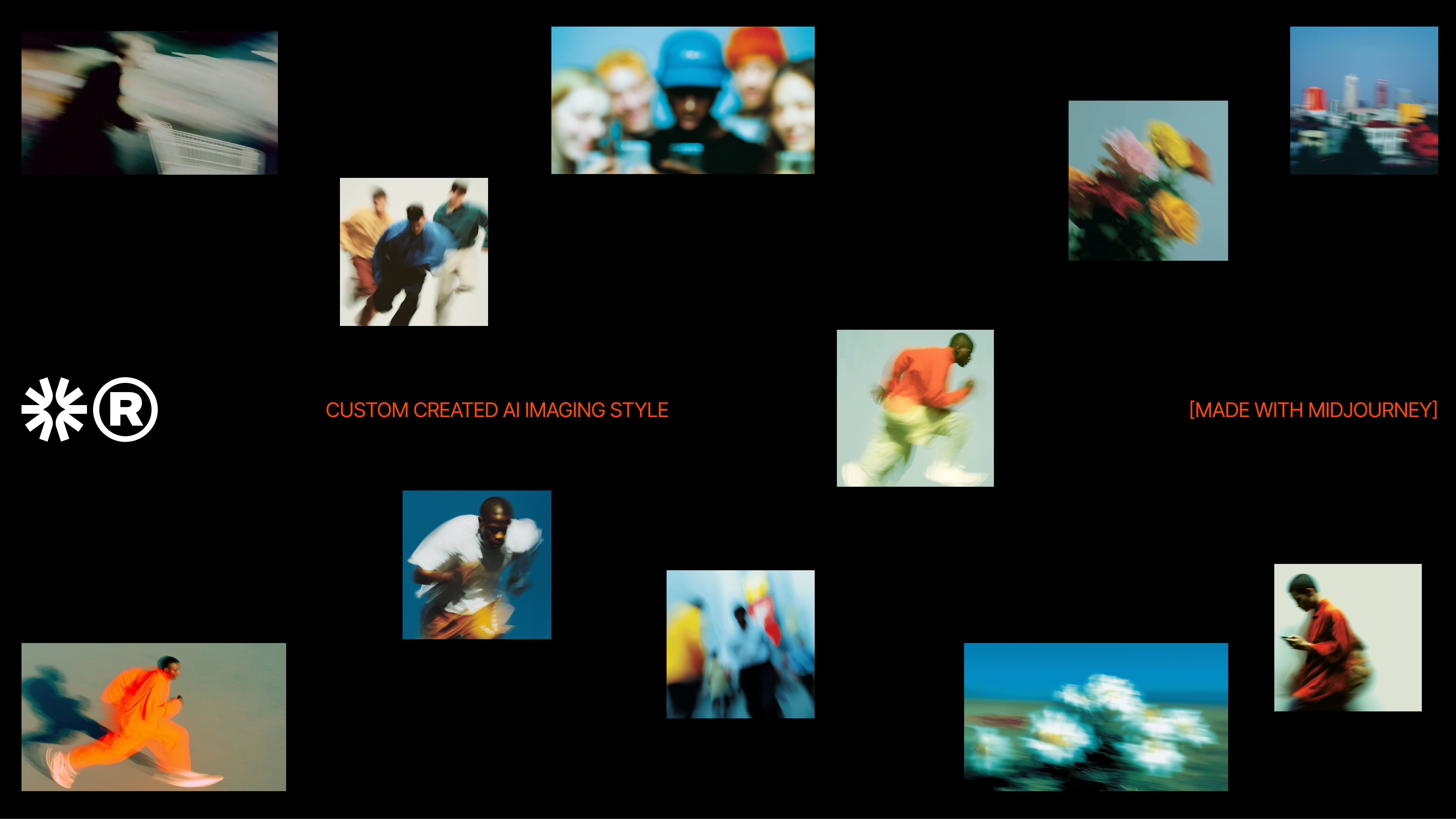
To further strengthen DEPT®’s connection with emerging artificial intelligence technologies, a prompt-based visual style was developed. This approach enables the generation of dynamic and vibrant imagery, reinforcing the brand’s innovative mindset and its continuous exploration of new creative tools and processes.
The expanding star was adopted as a central symbol, representing creativity as a driver for growth invention, the new guiding motto of DEPT®. The logotype was redesigned in close collaboration with DEPT®’s internal design team, ensuring alignment with the company’s culture and global presence.
The visual universe introduced a new typeface, Inter Tight, selected for its clarity, flexibility, and ease of adoption across DEPT®’s 48 offices worldwide. A new color was also added to the palette. Orange was chosen to express the brand’s bold and transgressive spirit while bringing warmth and energy to the system.
To further strengthen DEPT®’s connection with emerging artificial intelligence technologies, a prompt-based visual style was developed. This approach enables the generation of dynamic and vibrant imagery, reinforcing the brand’s innovative mindset and its continuous exploration of new creative tools and processes.